GREEN WALLET
The problem
Many diasporas find it challenging to register, renew or recover their documents and identity cards while abroad, namely passports, driver’s licences, and so on. These services are either provided by the embassy, an agency in the UK or back in the customer's home country.
Green Wallet is a company that wants to ease these challenges by providing an informative, and multi-service platform that solves these problems in one place.
UX strategy
PROBLEM SPACE EXPLORATION
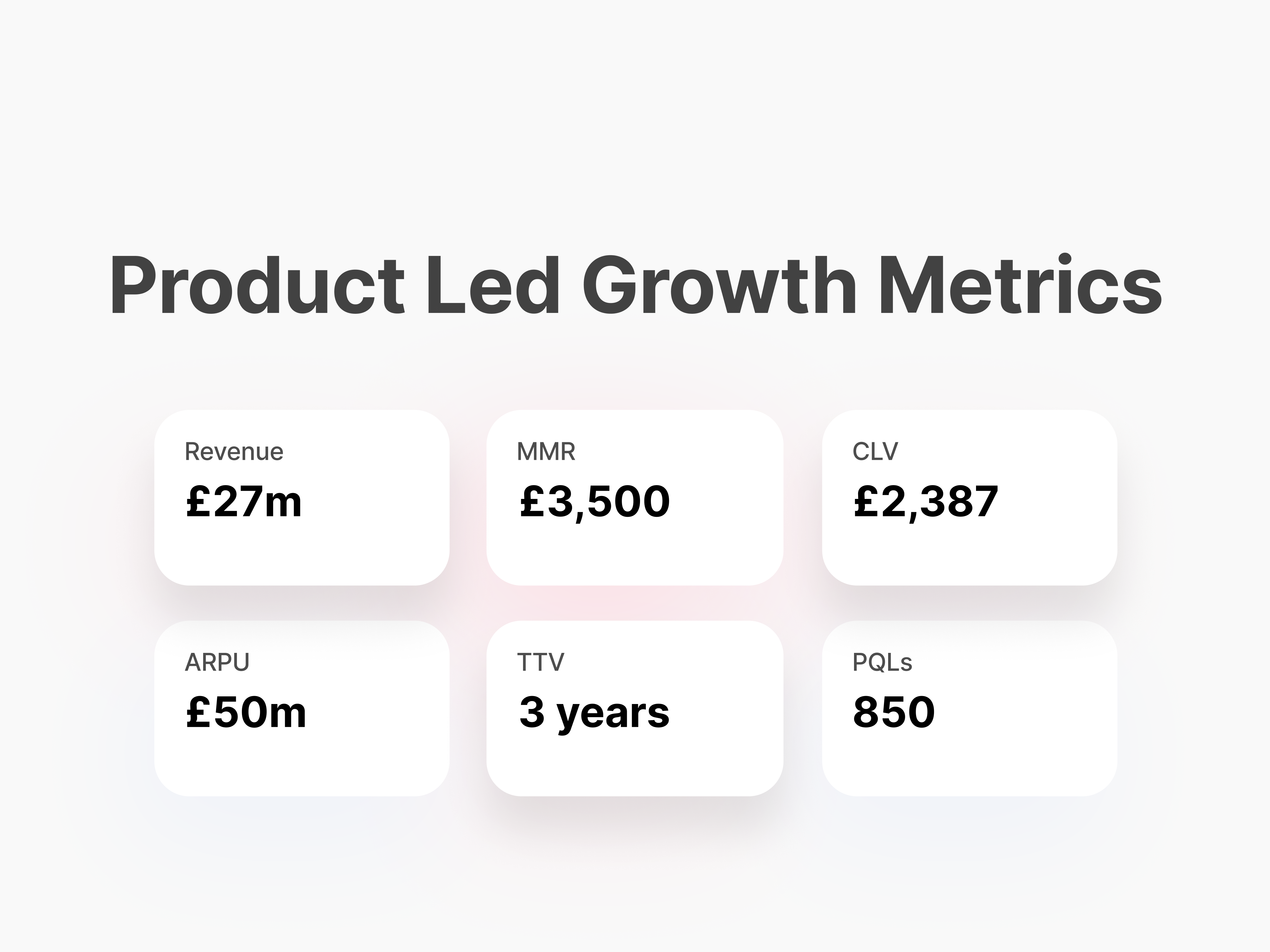
During my UX interview, the problem was presented to me as a UI UX website design for a National Identity registration service in diaspora with a three year goal of reaching £27m.
With the project mission and business needs and goals in mind I did a quick recap of key research topics that were important to the success of the business. The first topic was understanding the governing body that was partnering with international agencies to get the I.D's done, looking closely at their powers and operation, rules and regulations they have in place for the agencies to follow that may affect the the business or its website requirement in a negative or positive way.
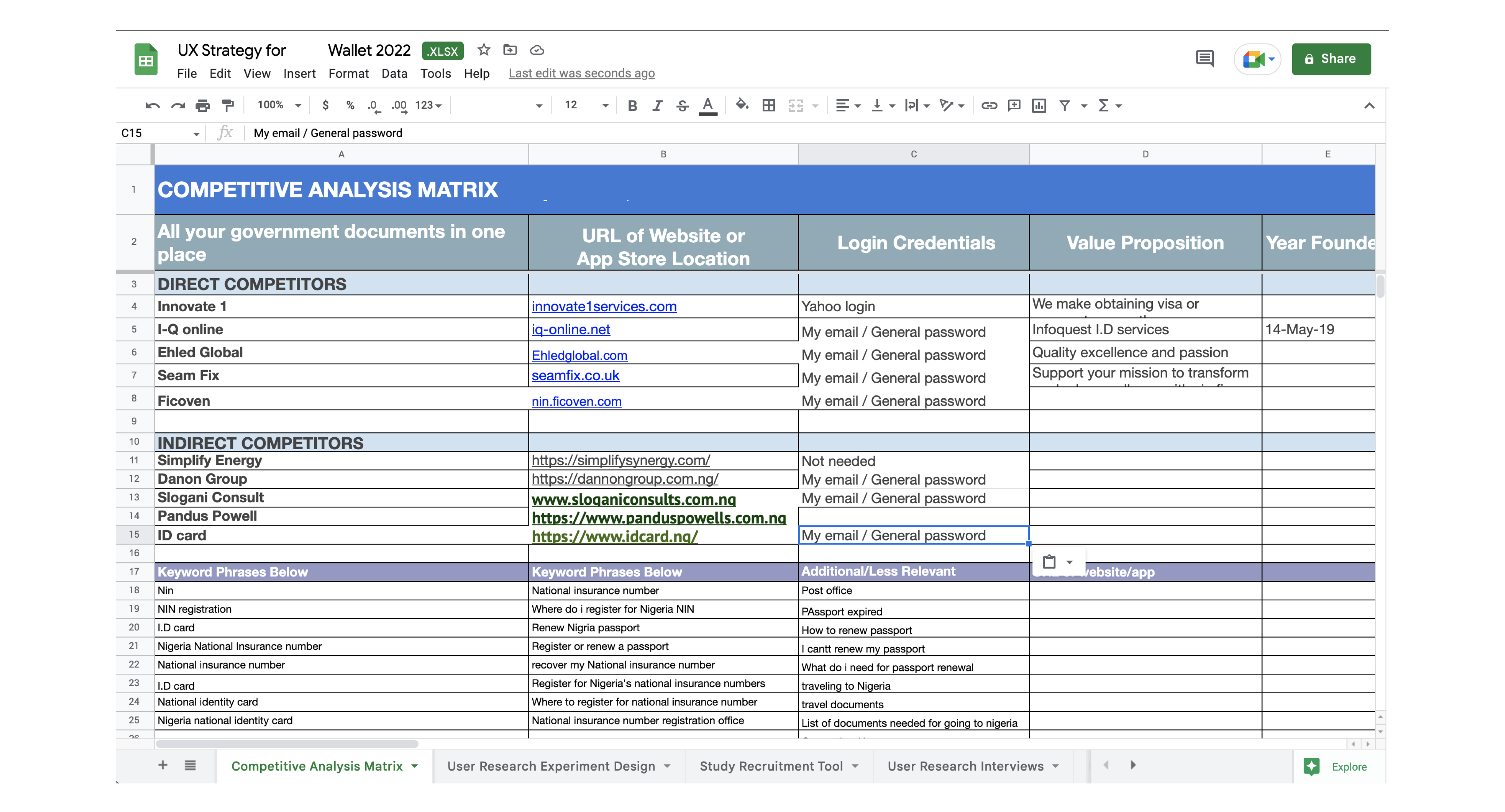
I then moved on to the competitors both home and abroad, how they operated locally, what are the general patterns of operation, if they are extending their services abroad, how fast they are growing, the types of technologies they use beside the generaly required technologies to help with smooth operation, how much they make, and they type of challenge they will present to my clients new venture.
I also planned on researching the customers both home and abroad to give me a clear understanding of their problems, and how it is being solved by the agencies and government, knowing that this is a compulsory requirement for every citizen I understood that they may be little standards, so i also added the need for me to look at how age, class, disability and timing is affected.
UX INPUTS TOOLS AND TECHNIQUES REQUIRED FOR THE PROJECT
Research
The problem was presented to me as a UI UX website design for a National Identity registration service in diaspora with a three year goal of reaching £27m, after researching the customers, market and competitors, it became clear that globally diasporans face this challenge and they want a tool that will solve all their I.D and document problems in one place,where they get key informations as they travel, and they find easy access to support when they need it.
For me to build a multi-service platform, I had to figure out how document and I.D agencies operate. With this in mind, I set out to research the first business that will launch with the platform. Nigerians are required by their government to register for National Identity Number before they can access any official Nigerian document, e.g. Nigerian passport.
After researching all the information available in the public domain, I then travelled from the UK to Nigeria to complete my research, I reached out to the government agency that created the National Identity management system. I tried to have a meeting with the director general but only succeeded in getting a meeting with the consultant that helped build the system, through him I got most of my remaining questions answered.
These answers covered all the government requirements to register diasporans abroad, the type of companies that can meet the requirements and how they make profit while offering the service. This led to a clear understanding of the complete business process and gave me enough data to work with and figure out the business side of the platform I will be building.
With this information in hand, I looked at the pattern of operation of three other government document services that will be a part of the platform. These are namely Passport support, Drivers licence, and bank verification number service.
KEY FINDINGS
All the government agency business processes follows a simillar pattern; You fill a form online or in office and then get your biometric captured, the agency then sends the information to the government, when your document is ready, your document gets sent to the agency or directly to you.
Design Thinking
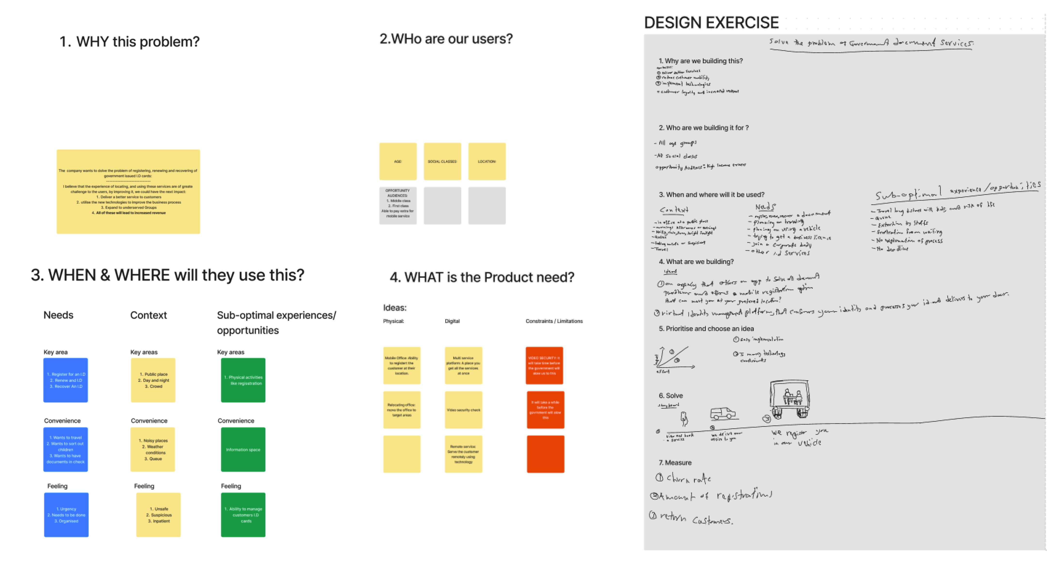
With clarity on business operations and requirements, I started with a one-hour product design exercise to quickly get my head around the project, stakeholders I will need to work with, schedule, communication, and project management channels, I then put my thoughts and assumptions in an activity I call a UX mind dump.
MY THOUGHTS AND ASSUMPTIONS
The problem is faced both at home and abroad, most of the time users find it difficult to locate a service that will solve their problem without travelling, facing bad weather, spending outside their budget, or bad customer service.
Most of the competitors require a form to be filled online, and some documents are submited physically.
There is not much use of technologies to make these services easier on the user.
Strategy, User Needs & Business Goals
I planned my UX strategy to align with the project deadline, my focus was on researching the business, users, competitors and how the technology, and the business will work within government requirements while still satisfying the customers. I also planned for user testing at this stage as it is an essential part of the process.
Business requirements
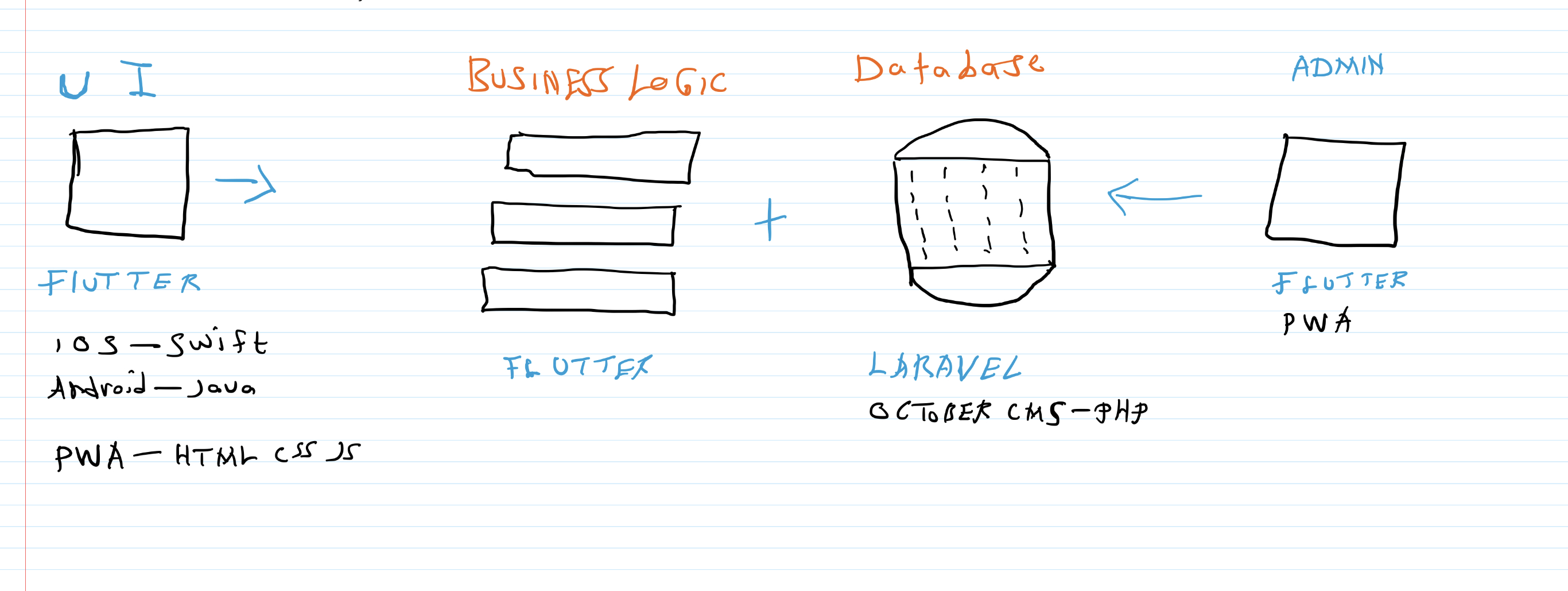
The business requirements is simple, create a platform that can manage an all-in-one service. The business processes data shows that there is primarily a form to be filled, payment to be made, and a profile to be managed, I researched the technology, and marketing requirements, I decided the platform will be built on Flutter.
Flutter is a build once and deploy everywhere platform, as the marketing does not require a strong S.E.O, which Flutter does not currently support, I decided to build the platform as an in browser web application which uses all platform elements and allows for installation of the app from a browser. As the project evolves, required securities and features can be easily implemented and deployment can be easily done on IOS and Android app stores if needed.
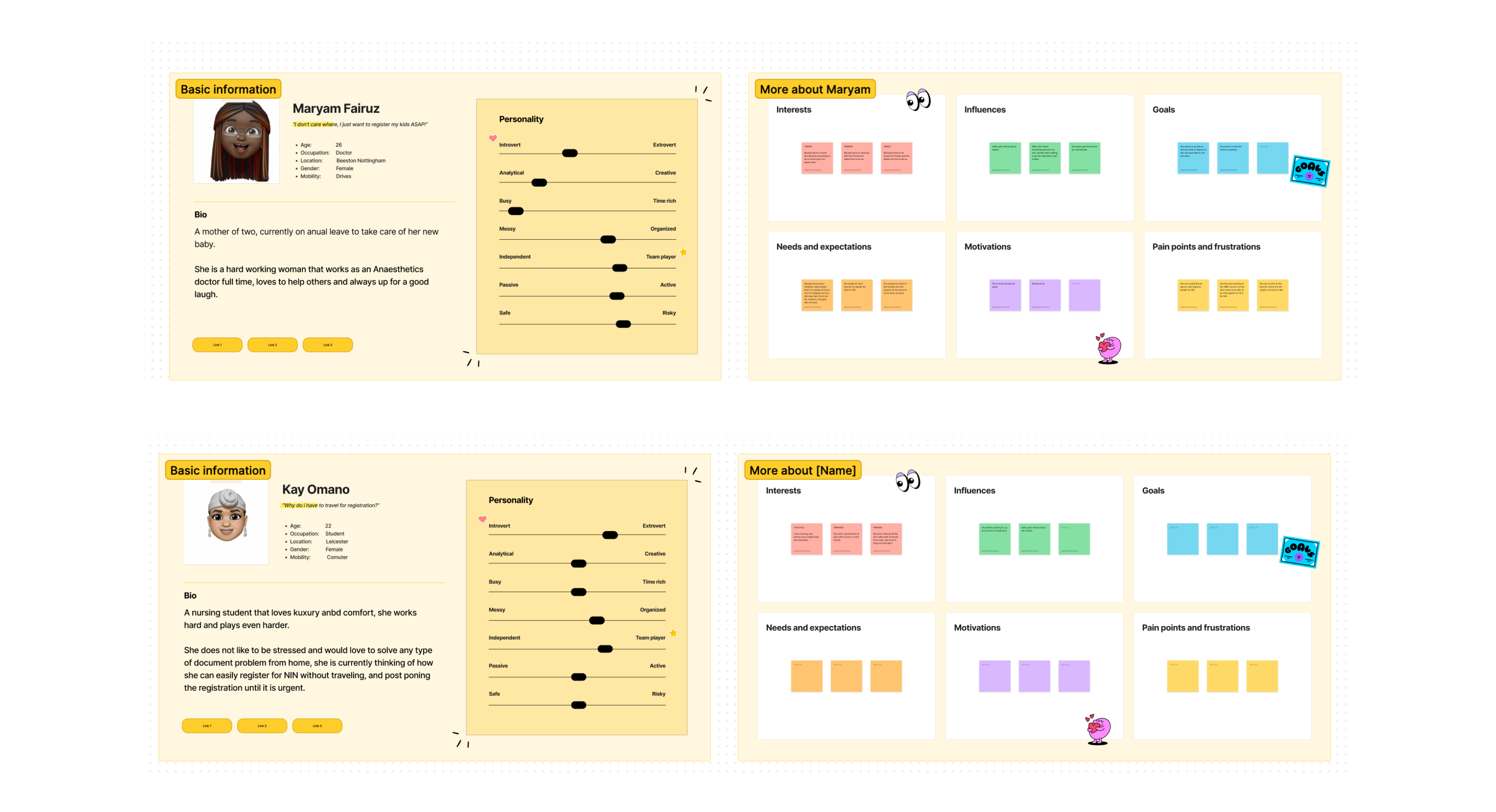
Persona: User needs and wants
With a clear understanding of the business goals, processes, requirements, and assumptions, I focused on the users and how I can figure out ways they will interact with the platform, what they expect versus what the platform offers, and what I need to do to balance them out.
After planing and compiling my survey, I started by asking friends and family about their experience while registering for NIN. Then I spoke to others who are not yet registered to find out more about their knowledge of the requirements and what their plan is for registration.
An expected pattern began to show, proving that the same conclusion I reached before the survey was accurate and also giving me more insight into customer pain points, before interacting and after interacting with the agencies.
Most of the users were unaware of the government requirements which were launched in 2014, they primarily got to learn about it when their passport expired and they went to the embassy to renew it.
The official National Identity website offers a complete list of companies authorised to register you abroad.
The UK agencies offer services like construction, import and export, these services are not related to national identity registrations, they are not able to create a good experience for users on their sites, and regards to the physical service, they dont try to make improvements based upon customer feedback.
To build an all-in-one platform that will cater to all these businesses and provide a simple but effective user experience, I used the data gathered and created five persona's between the age of 18 to 60 and made sure I had students, parents and professional social classes within my personas.
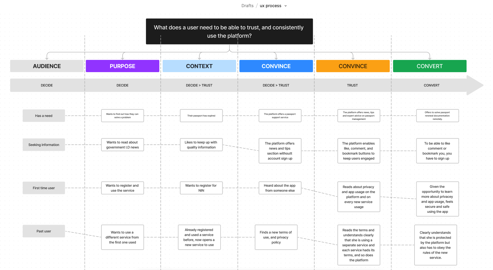
Decision Path
With the research of four different services in hand and a customer survey for one of the services, I was able to move forward to see how the customer can navigate these several services on a single platform and make a buying decision.
Using decision path progressive disclosure methodology, I figured out the most minimal and natural way to present information to the users without cognitive load.
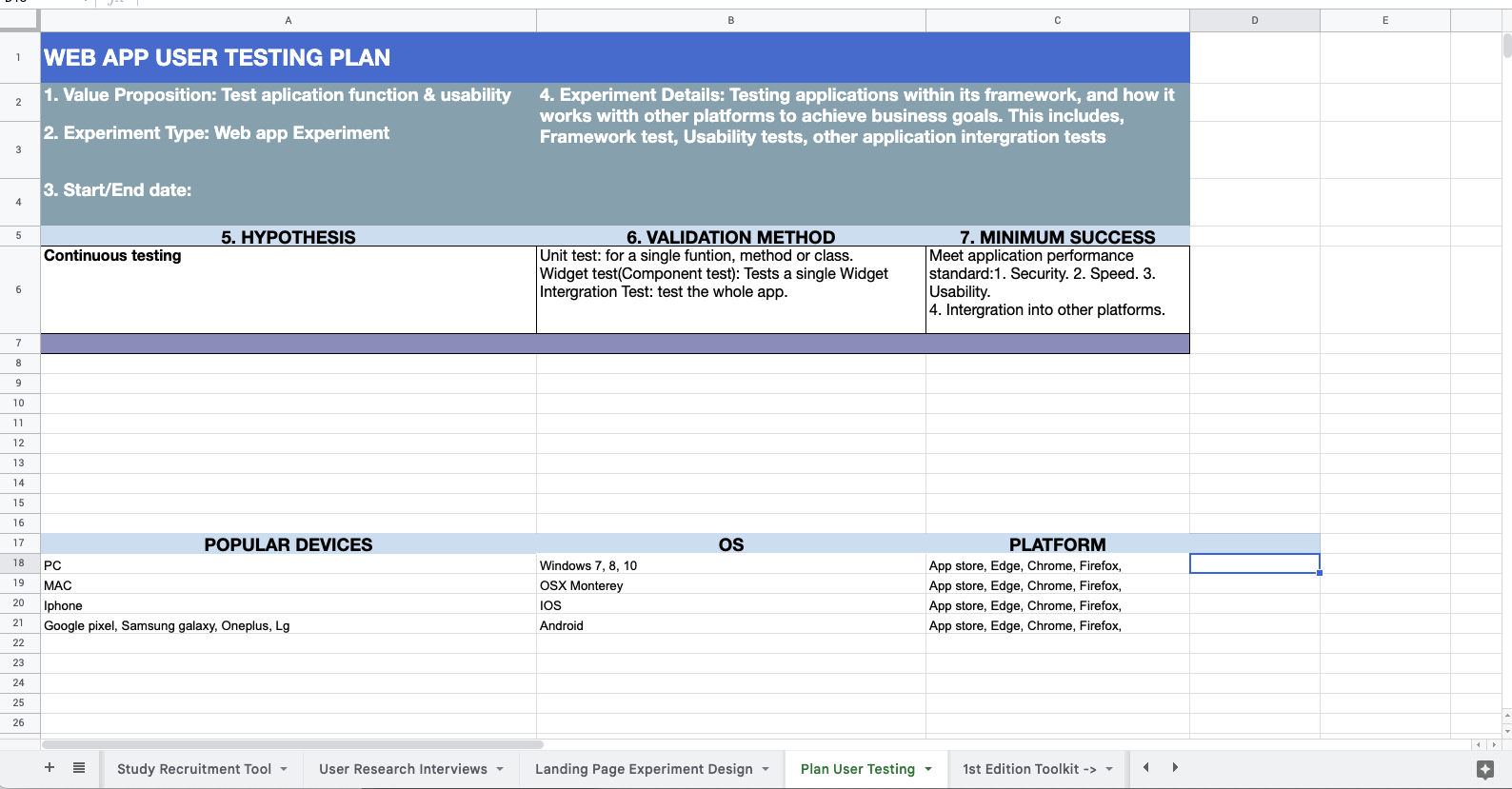
Planning for user testing
To get additional clarity on the scope, I plan for user testing at this stage. This helps me think closely about the development requirements and constraints, and the best approach to designing the application with development capabilities in mind. At this stage I research the devices, operating system, and technical ability of my demography and list a test checklist, which includes but not limited to:
- Device and browser support
- Functionality tests
- Usability test
- Errors and exceptions
- Compatibility test
- Performance tests
- Security test
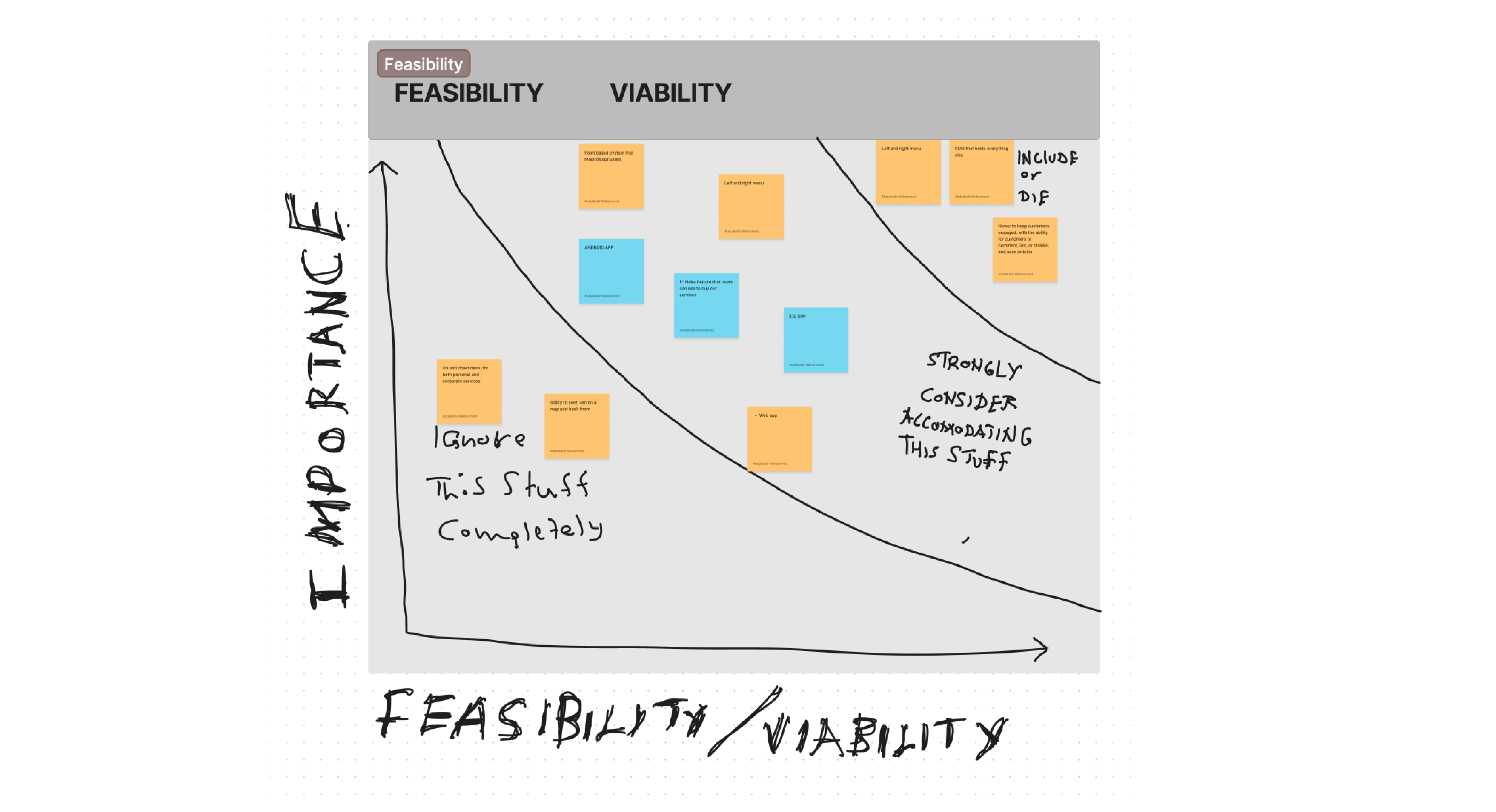
Choosing what is worth doing
During the research phase, I came across a few agencies that were interested in the project and this influenced the business goals, some of the influences were the addition of a digital currency feature that will encourage the spending of your country's currency on the platform while abroad. Some of these influences led to evaluating the features and prioritising things of high importance that need doing and leaving the rest for future updates.
One of the ways I solved choosing and sticking to key features was by using the "Buy a feature" game: This is a simple and effective game for getting people to choose features they would like to see in the finished project. Ideally, your players are prospective users - but it is just as valuable with a client.
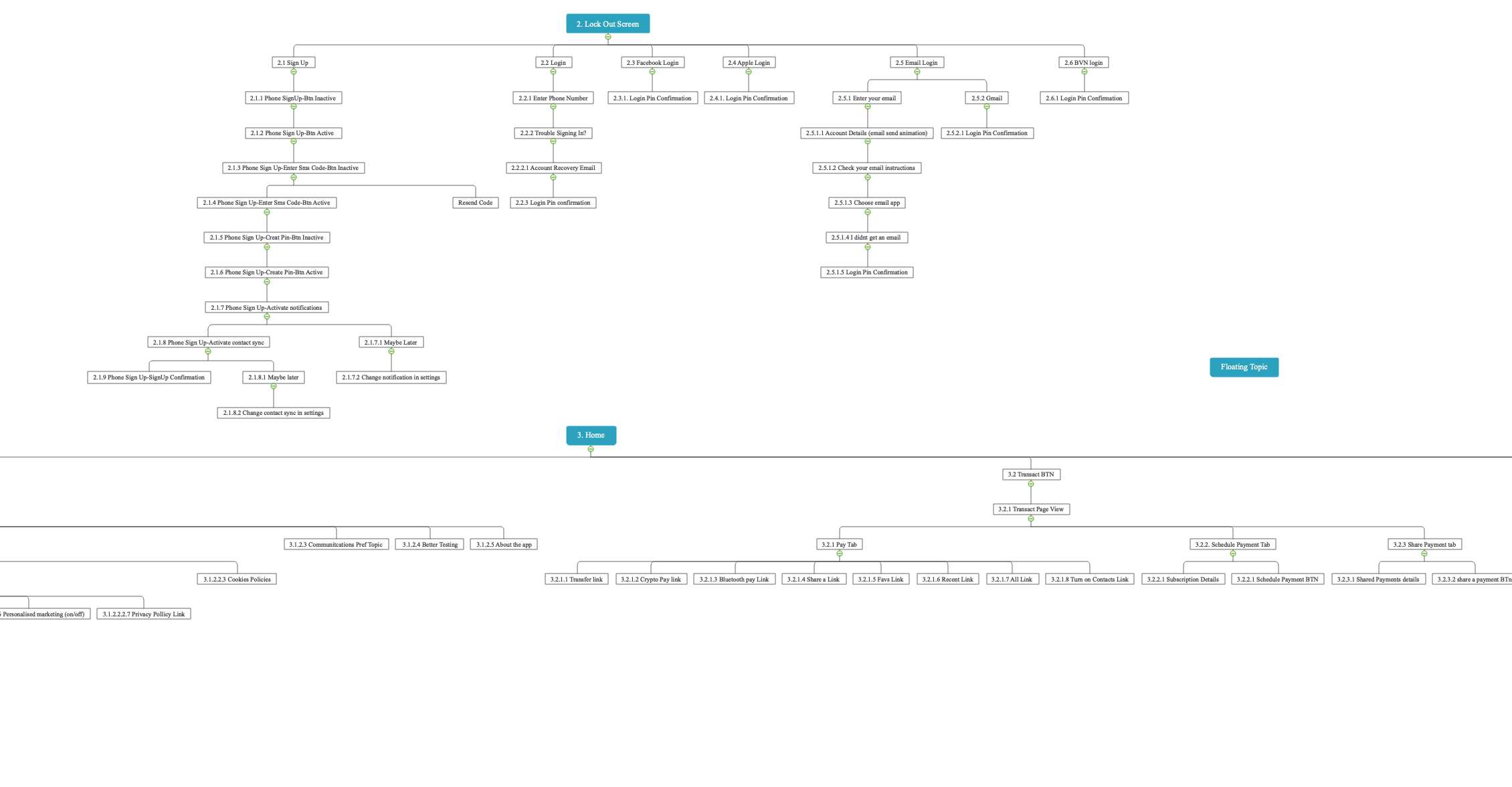
Information architecture
I moved on to creating the Information, I broke each feature into its section and created the site maps.
User flow
Based on the simplicity of the site map, I developed a short, and simple userflow, which is key in the applications usability strategy.
One of the ways I beat the challenges I faced while trying to validate the user flow within the time I had was by creating the user flow and turning it into an interactive low-fidelity prototype in Axure.
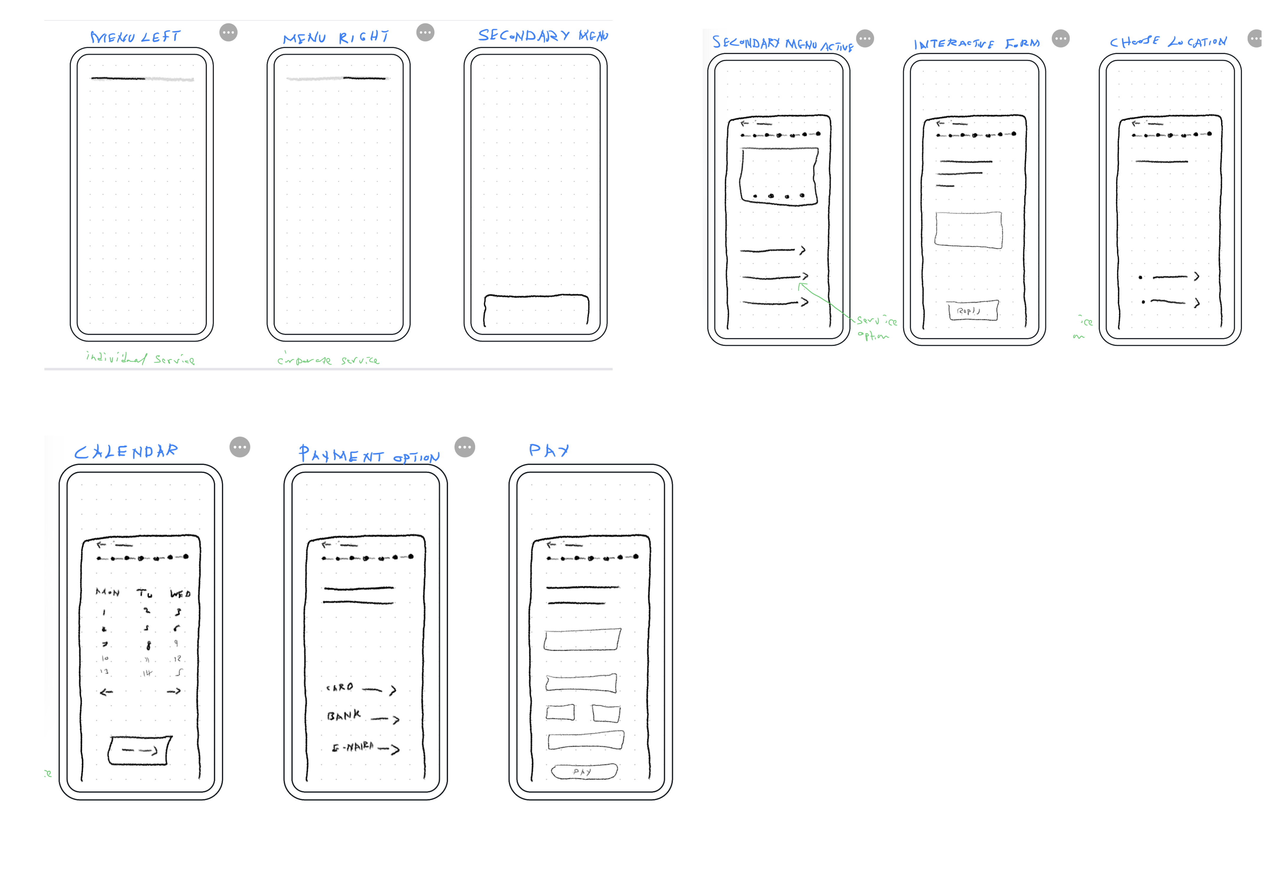
Sketches
While sketching for the project, I focused on the key framework, which is the content management system. With the CMS sorted it was easy to implement the rest of the solution directly with the wireframe.
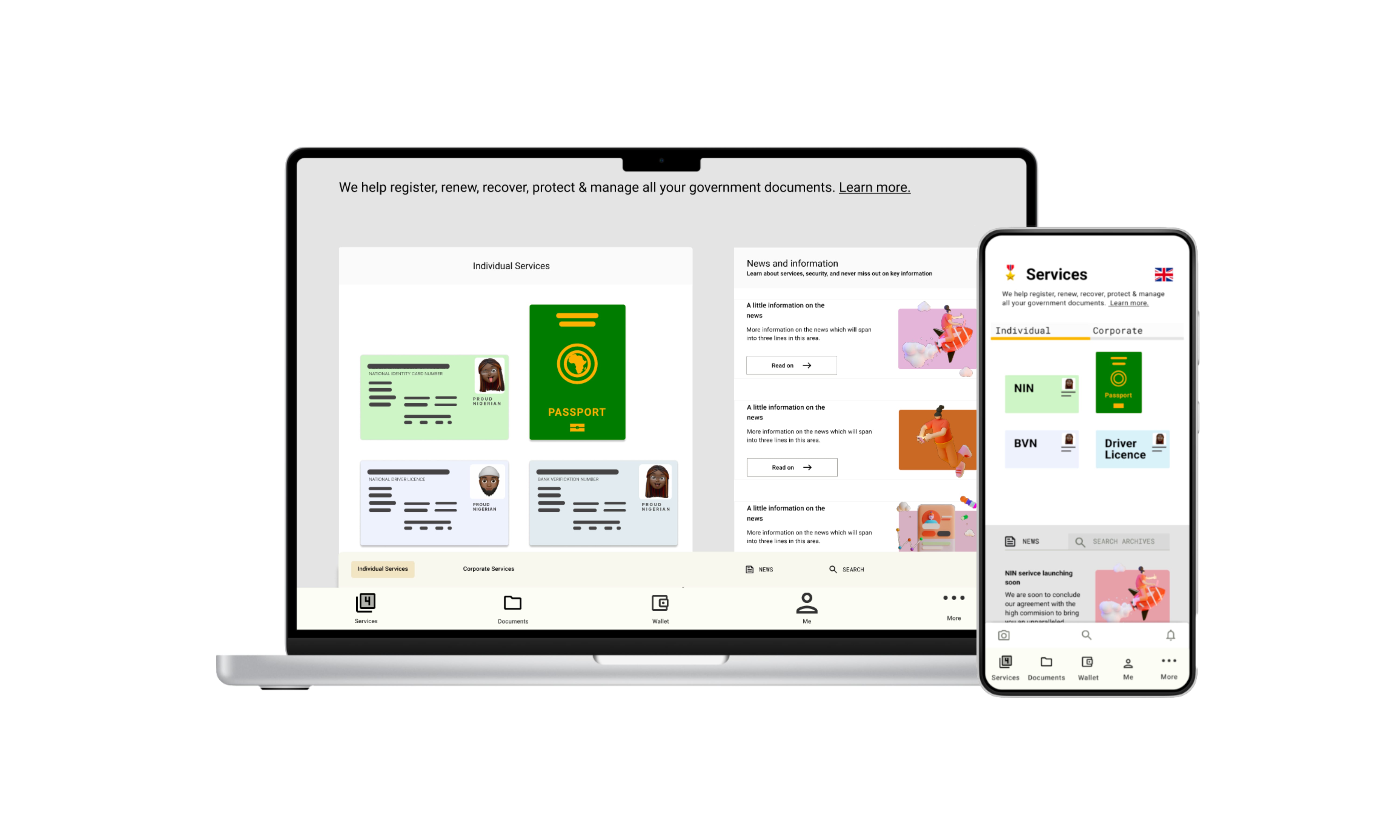
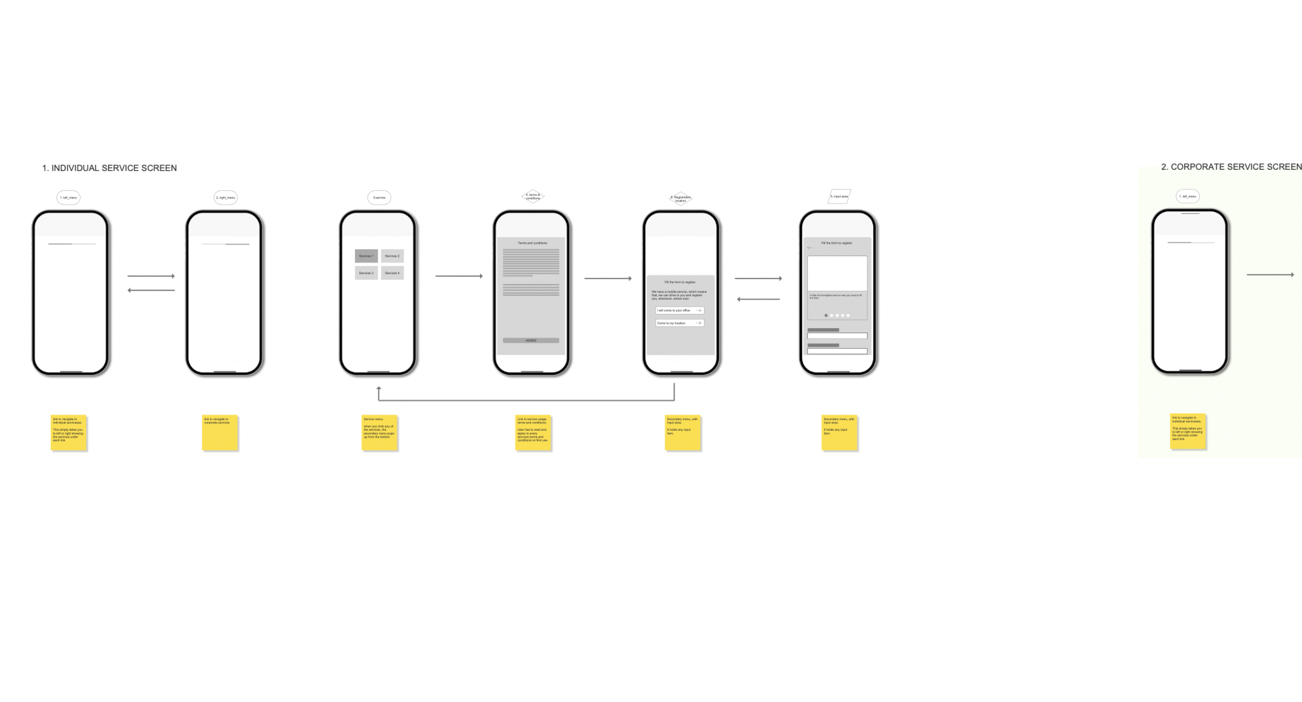
Wireframe
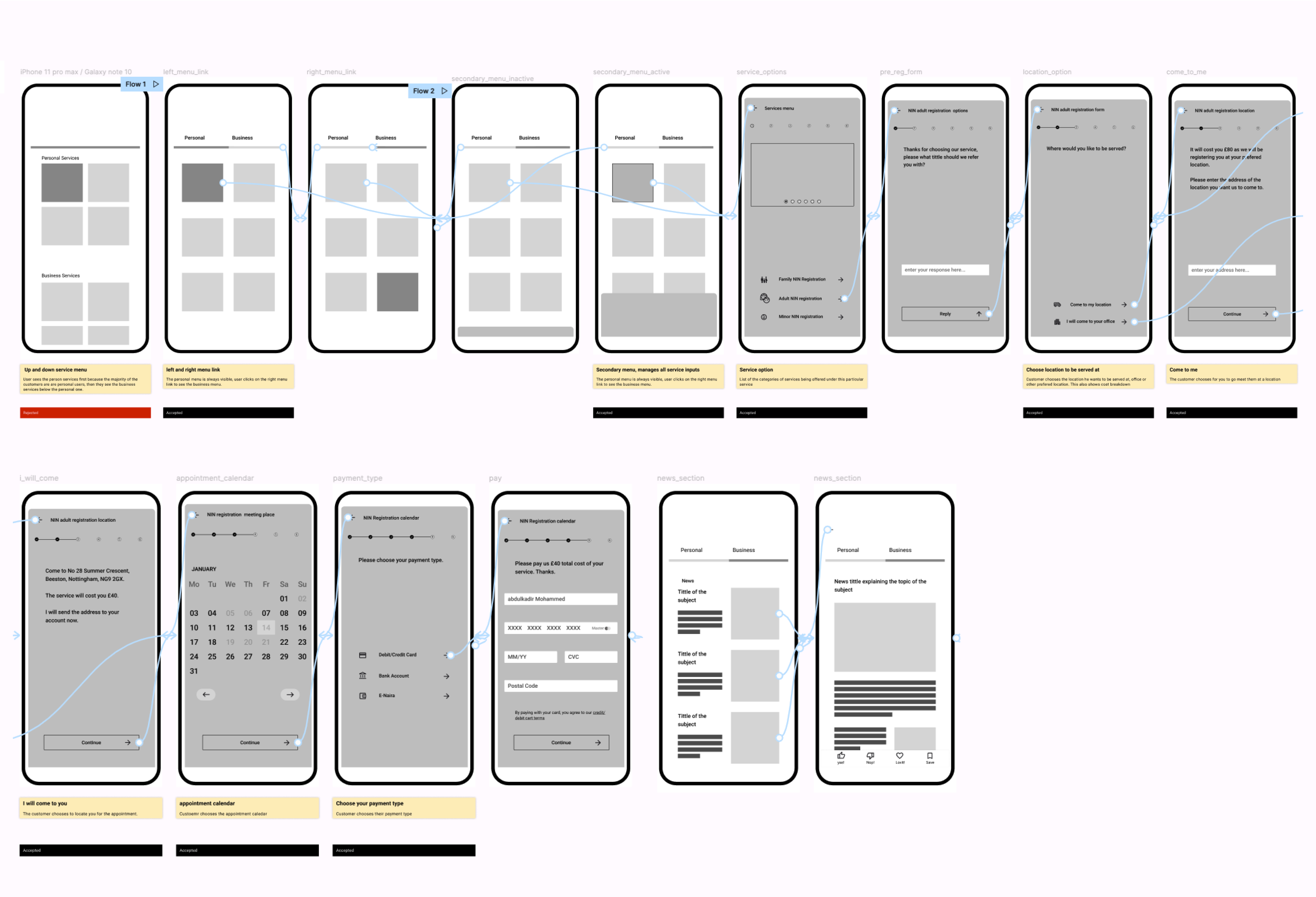
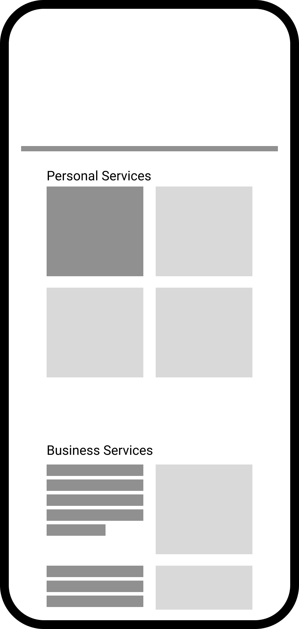
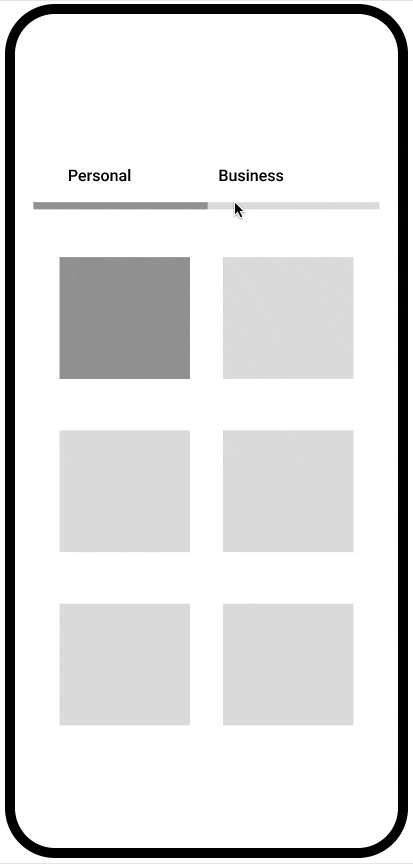
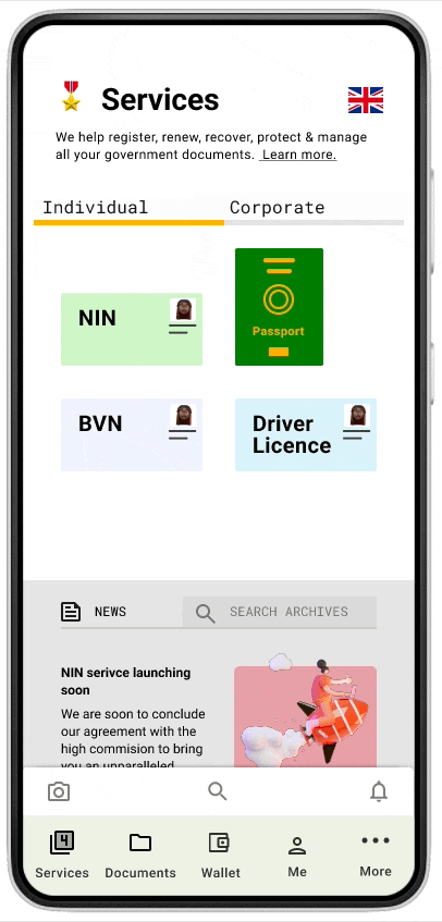
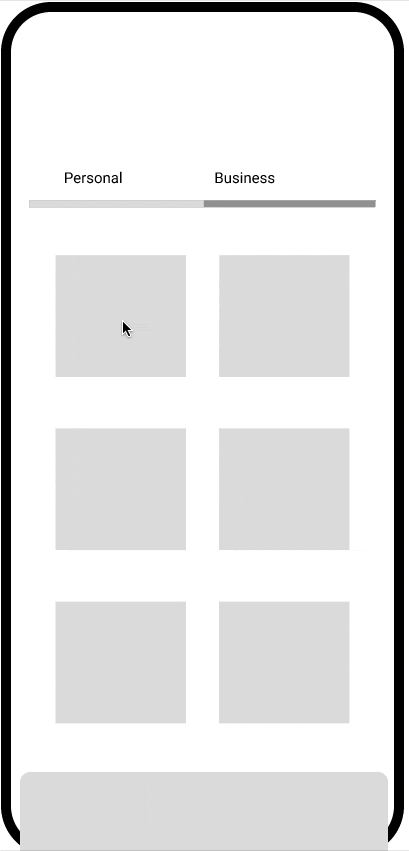
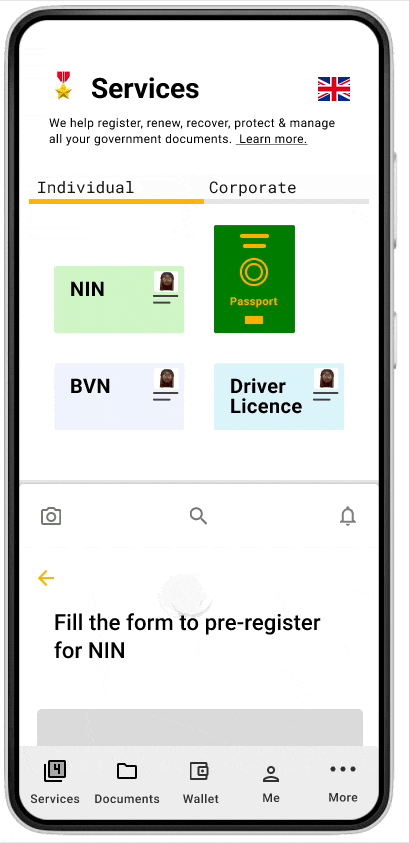
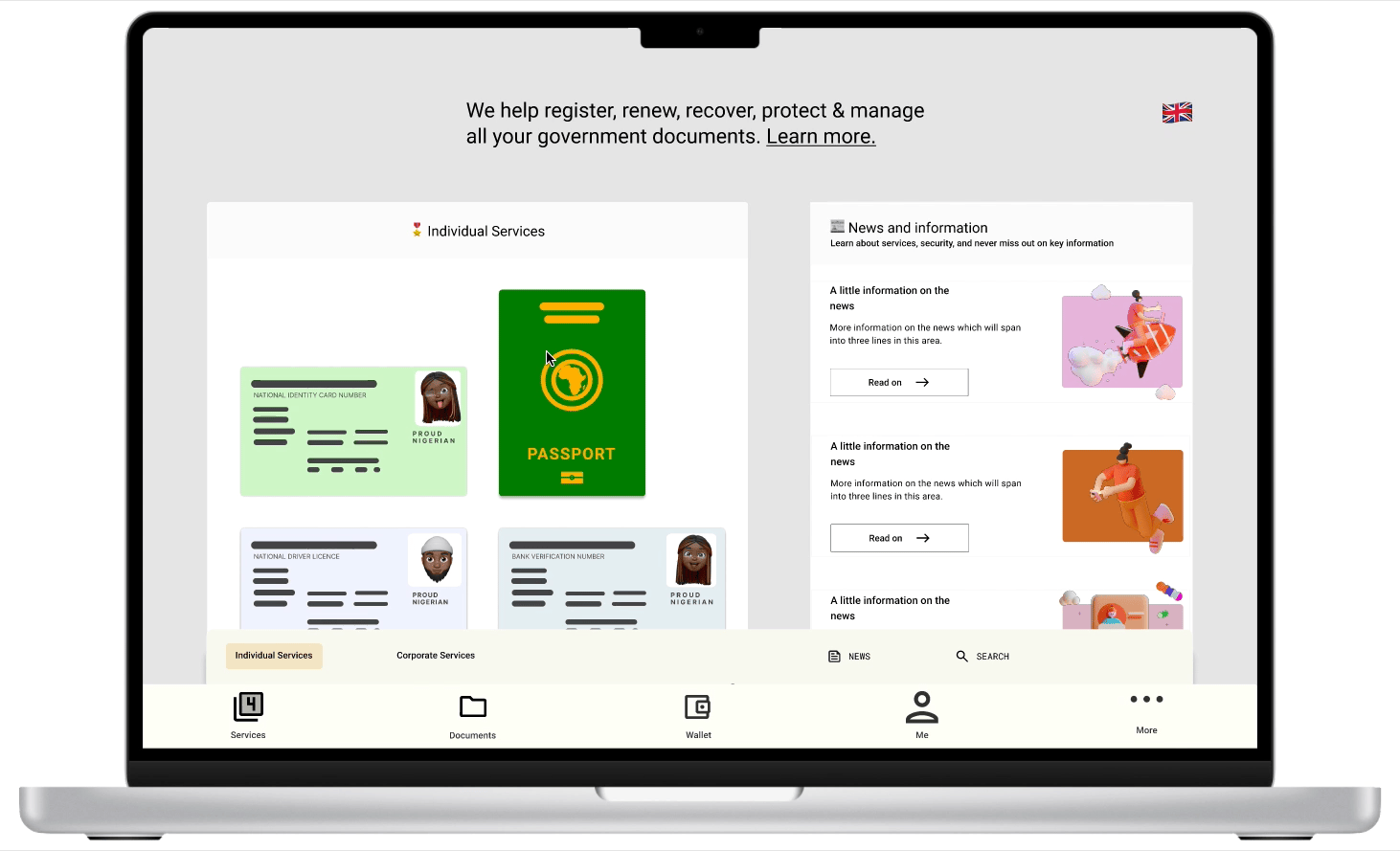
My designs were solved in stages, I figured out the menu placement (left and right) for the personal and corporate services, then solved how the service will be presented with the secondary menu that pops up to display information.
I then solved each of the services screen, based on user data, the individual service screen should be the landing page.

How I categorised services for easy navigation
Many of my design decisions were made with the customers in mind. Choosing a left and right navigation to reach individual and corporate services gave us a better result than a single vertical scroll menu.
The decision on the first menu to be displayed was made based on the primary customers. An individual user uses both services.
How users will understand the way the platform operates
The company will sometimes partner with other businesses or government agencies to bring their services to the platform. I had to figure out how to share this information with the user without causing information overload.
The companies mission statement is to offer a professional service with transparency, I focused on that and used it to design a terms and agreements screen that a customer will come across on first use of each service, this is first presented as a summary of the terms for a quick read through, and then a link to the full terms for deeper understanding.

Simplifying the activity menu
Each service has a piece of information or a form that the user has to fill out, I ran an A/B test on two options, the ability for each service to navigate to a new screen or quickly pop a modal that displays information. The modal had more positive results on users, it quickly pops up on the same screen and can be dismissed easily, it also made accessing some secondary menus really easy to implement.
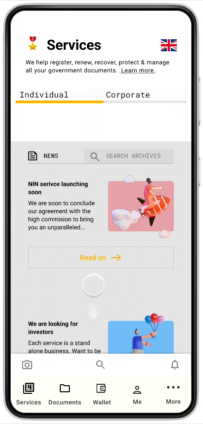
News & blog section
One of the key requirements for the project is the ability to implement notifications for services, news, and blogs, the channels that receive the notification data are the news section, in-app notifications, and email.
After A/B testing two news screen options, the most favoured option was to display the news below the services on mobile and the right of the desktop. This option still gives a good experience even when other services are added and it goes beyond the screen, this is because the profile section holds your saved articles and you also get news notifications directly in your profile.
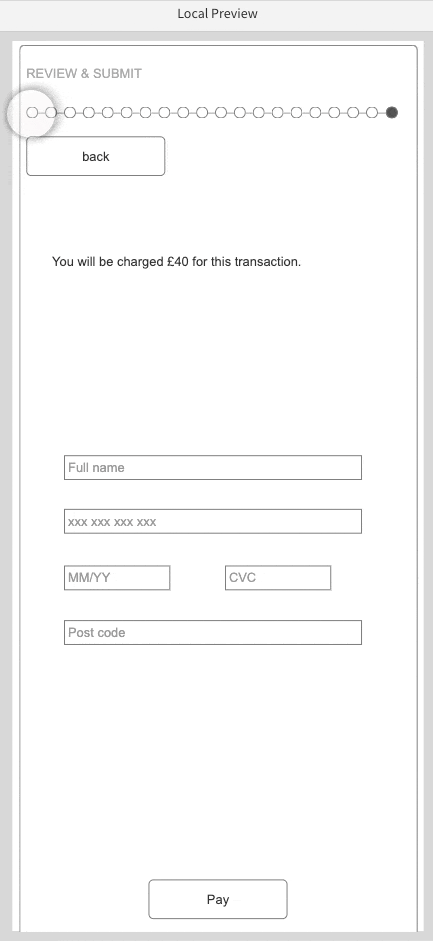
Services Form
Initially, I implemented a simple form for the project, due to time constraints, but after reviewing market trends, I decided its best to implement an interactive form, I created a high-fidelity prototype in Axure, which allows me to create a wireframe and prototype at the same time with a function as close to the development version as possible. After a few A/B testing and feedback from users, it was decided to be left for future updates, this was because the results were similar for both forms.
Desktop & Mobile phone menu choices
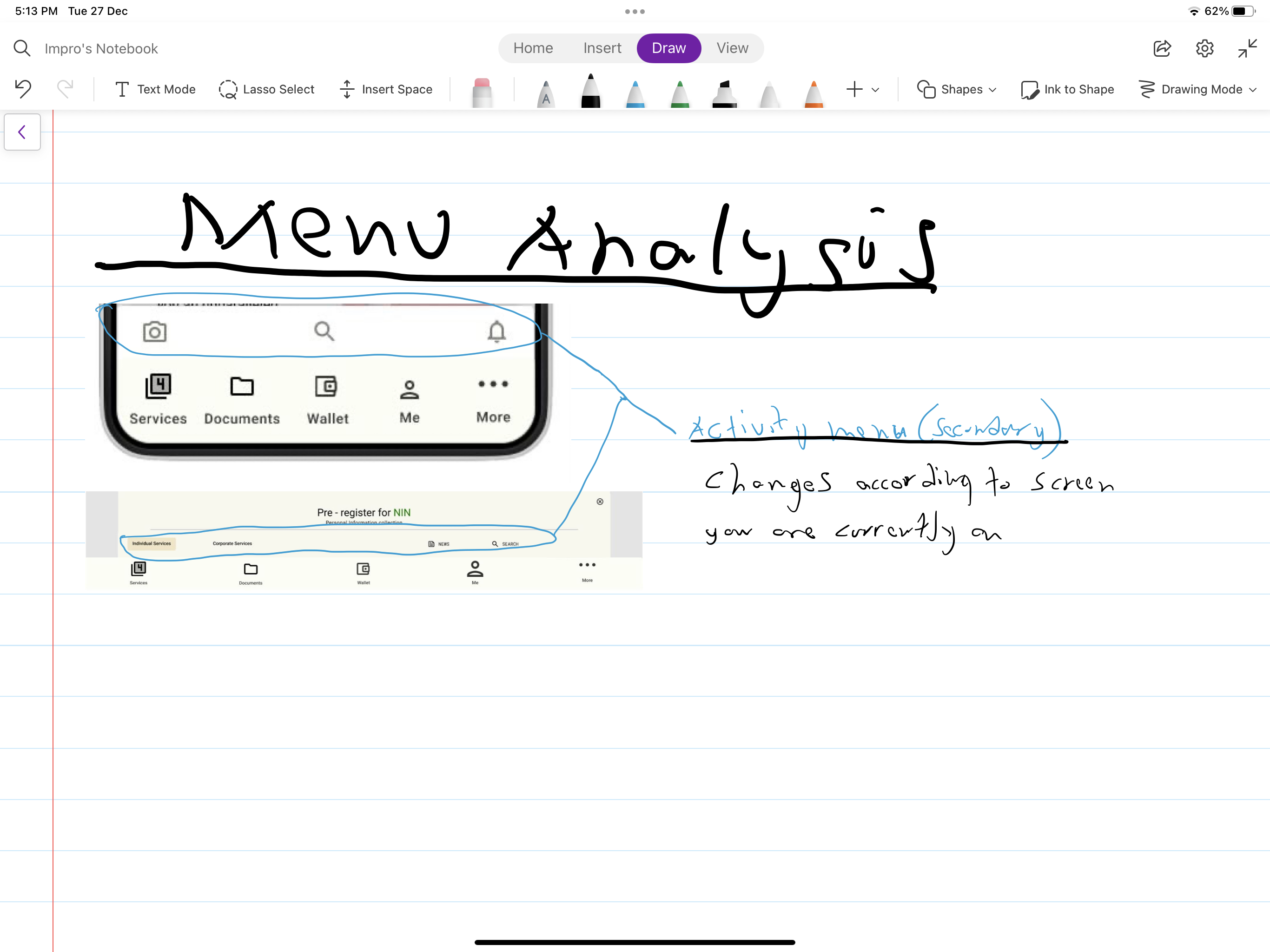
The desktop menu was a voluntary option to leave the menu at the bottom of the screen, this is because the app is an installable desktop application and emerging trends show that even web browser menus will move to the bottom in the next three years.
The Secondary menu is designed to be fixed at the bottom for desktops but on mobile phones, it moves to the top with the activity menu, and the menu type changes according to the pages you visit.
The activity menu holds all input and output, it can popup and show activities you need to do for each service you choose. These choices are based on validated results during testing.
The primary menu for desktop and mobile act the same way, the only difference is that the elements displayed on the screen change due to screen sizes.
Location recognition
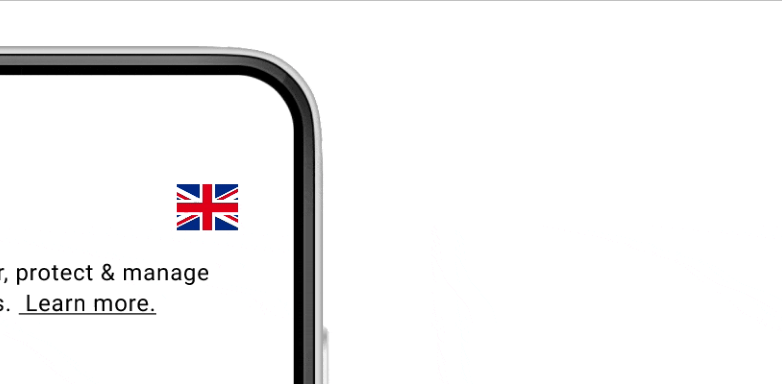
the platform's service costs are different in each part of the world, this influenced my design, features that i added to higlight this are, using a simple flag icon that changes at new location, sending users notifications of changes of location, and sharing information on services and costs affected by the new location.
Higlighting platform security
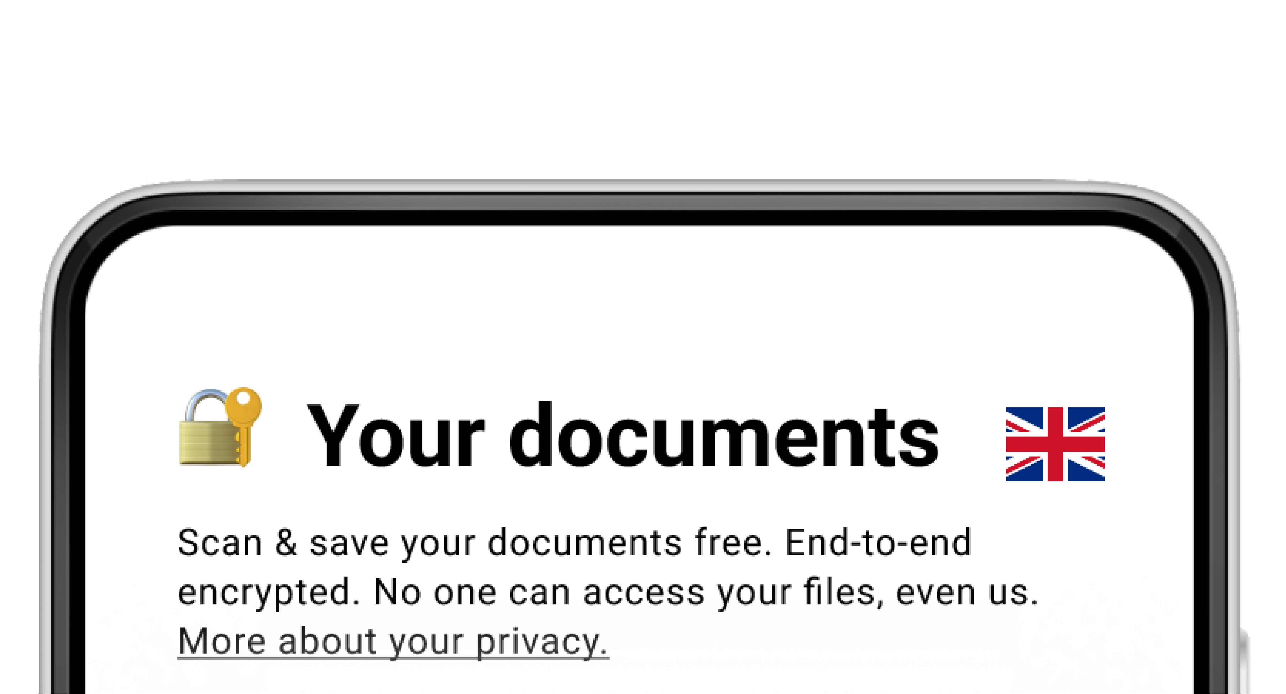
Security is a massive part of an application that holds users private data. The platform files are planned to be encrypted using 256-bit Advanced Encryption Standard (AES) the platform uses Secure Sockets Layer (SSL)/Transport Layer Security (TLS) to protect data in transit between the apps and its servers.
My job is to use design to re-enforce this and assure customers that their data is secure, The simplest solution I settled for was using the padlock and key icon on each heading, and a caption that reminds the customer of the security feature of every page, with the ability to read further on these features.
Free document scanner
A free service to help customers save important documents, this ensures they have a digital version of their documents anywhere they go, they can easily share required documents with agencies, families and friends, or even print.
The document scanner is a free strategic service that I introduced as a way to make the platform more useful for the user, keep the user longer on the platform and keep the user coming back to the platform.
Final product
The result is a combination of a service-driven design, comprised of core management software (CRM). A simple presentation of services and information, a free document management section, and a money management section.
Measuring success
From my UX results I believe that for me to know if my work was successful, my solution has to be able to keep users coming back, cause excitement amongst users, and the industry at large, change the industries service style completely and most importantly help the company reach their goal of £27m in three years.
The demo of my high-fidelity prototype helped get the right partners for the project, and an investor said "Yes" during the pitch.
My pattern library will help in reducing collaboration time by 50%.
My Bootstrap MVP will help in reducing development time to about 60%.
The next steps are to observe, test and repeat until I can meet all metrics.
Deliverables
UX Strategy Documentation Every UX project starts with a strategy, I develop a UX strategy based on data and requirements the company provides.
User Research Documentation I ran user research to hear the user’s needs, understand the actual needs, and highlight the unknown needs, which will enable me to advocate for the user.
Industry & Market Research Documentation I ran industry and market research to validate the data given to me, deeply understand the business, and be able to see how I can add value to the research at hand.
Competitive Analysis Documentation I chose to run a competitive analysis to compare research and validate, and understand the business, the pattern of operations, technology and trends.
Riskiest Assumptions Documenttation I ran the riskiest assumptions research, to identify, categorise, analyse, and validate assumptions.
IA & Site map Workbook &Documentation I chose IA and sitemap because I am designing a digital platform that requires the provision of these data, to figure out how users will navigate the platform.
Sketches, Wireframes, Prototypes Workbook & Documentation I chose sketches, wireframes and prototypes because I had enough time to run a full visual research and design.
User Testing Documentation I chose user testing to test models and solve usability problems at each stage in the project.
A/B Testing Documentation I chose A/B testing as part of the UX process because the application has some complex navigation problems that needed more than one design.
Fonts, Colours, Typography, Spacing assets & Documentation I provided these requirements because they will use it as a reference for future updates.
Style Guides, Pattern Library, Design Sytems HTML & CSS templates & Documentation I provided these assets because it is a part of the requirement, they will use it for reference and development amongst teams in the future.
Design Assets & documentation I designed the application because it was part of the deliverables, and I have the skills to deliver.
High fidelity prototype Assets & documentation I provided a high-fidelity prototype because we needed to use it for development pitch deck.
Pattern Library Development Assets & Documentation I developed the pattern library because it will be easier for collaboration than design, this reduces collaboration time by 50%.
Bootstrap Prototype Assets & Documentation I created a bootstrap prototype because the project launch failed because of funding, with a bootstrap prototype it was easier to move the project to the development phase with a 60% reduction in development time.